We noticed that a considerable number of our online marketers don’t pay much attention to design. This is reflected in both the way they agency is looking and in the services that they deliver to their client.
Design in LOCAL marketing is more than the logos, images, page layouts, and unique fonts that comprise your brand’s aesthetic; it is the ‘magic sauce’ that connects your company to your brand, and ultimately to your customer
Want the services that you put out to stand out from your competitors? Add graphic design on your marketing strategies.
The right marketing tools can boost your engagement and sales but with the addition of strong graphic design, you’re on your way to long-term success. Your clients will thank you for this.
Because we understand the key role that design plays in Local Marketing and we noticed that some of you aren’t aware of that, we created a resource that will help you understand How & Why you should do GOOD design.
Let’s get some things straight
Not only does design help attract attention towards your marketing, it can also enhance the quality of your message. Both your clients and your agency will see improved conversions if you manage to upgrade your design skills. For more specific instances of how design influences your marketing, look no further than the examples below.
Brand Identity, Look, and Feel
When you think of the world’s most well known brands, you can instantly picture their logos, unique color schemes, and even fonts. This isn’t something these brands luckily stumbled upon; a lot goes into developing the ideal logo, finding the perfect color scheme, and making the right font choices.
Psychological studies have been conducted to see how people perceive different colors, and marketers use that in their branding to help convey quality or a different message.
Certain colors can create excitement or sadness, increase appetite, or even create a feeling of warmth or coolness. If you want to convey your product/service is high-end, for example, brands will often use colors like black, gold, or silver.
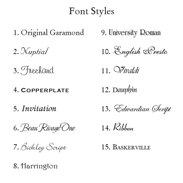
In addition to the color scheme, a lot of work goes into developing the perfect font for your design. Selecting the proper typefaces, size, and style is crucial for developing your brand identity, and everything about the font is closely considered from a designer standpoint, like weight, kerning, leading, point size, feeling/style, etc.
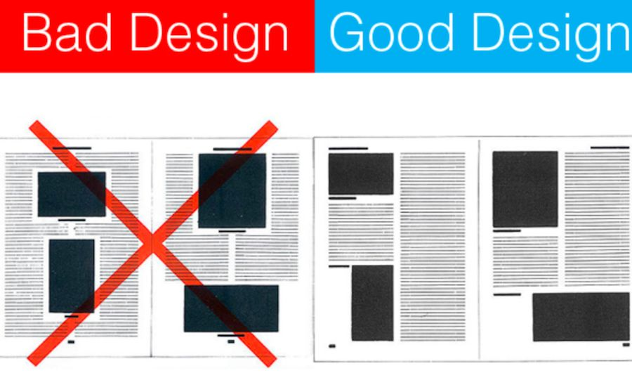
The fonts you use are a reflection of your company, much like the clothes you wear to an important sales meeting. Some fonts are more comparable to suits, while others are more comparable to pajamas.
Boosting visibility
With so many companies competing for attention online these days, having exceptional design is one of the best ways to differentiate yourself from the crowd.
Likewise, if your design just stinks altogether, you really have no chance of being noticed.
As humans, it’s in our nature to habituate our environments and become familiar with things that don’t stand out. If people noticed every detail of every little thing, there’d be information overload.
For local marketing consultants, it’s important to visualize your marketing the way your target persona sees it, so you can better determine what would help it stand out, and stay away from designs that make it unappealing to them.
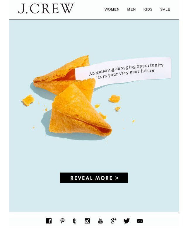
Getting your target persona’s attention is just one part of the equation, however.
Once you have your persona’s attention, you now need to keep their attention, and good design helps you do that.
Have you ever seen a targeted ad on Facebook, for example? Have you clicked on it? If the art direction looks good and the topic is relevant to me, not only will it catch my attention, but I’m also much more likely to click.
When the photo, design, or topic is irrelevant to me or features an uninteresting picture, however, then I’m much more likely to keep scrolling.

Conversion and ROI
Great design can do a lot to help improve your marketing efforts, and it does more than just help your content stand out and look good.
Using the right design can help influence more conversions, and ultimately improve your ROI. It’s been proven that photos of people can help increase empathy, for example, as researchers have found that people feel a deeper connection to images with other people than those without.
Photos of women, babies, and attractive people have also been proven to increase visual response rates (sorry regular people!), and photos of objects can also help increase trust (e.g., detailed product images).
When combined with conversion opportunities, relevant, well-placed photos like the ones above can help increase conversions on your offers, and eventually more customers.
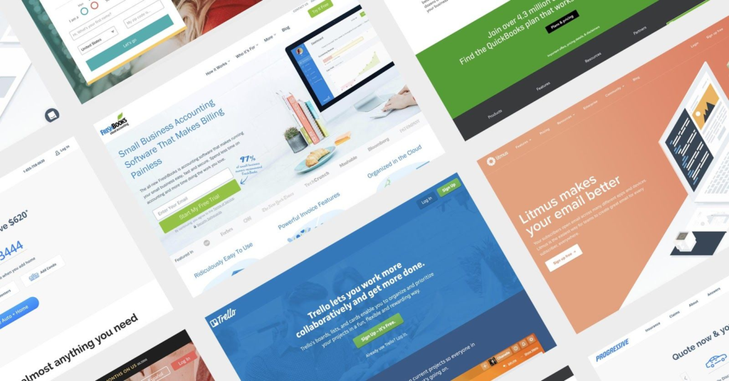
4 Tips for a Better LOCAL Marketing Design
Before you get started jumping into new design goals for your agency, there are some things you should know that can help you get the most from your investment.
From our own design experience, here are four design tips that can help you achieve better results:
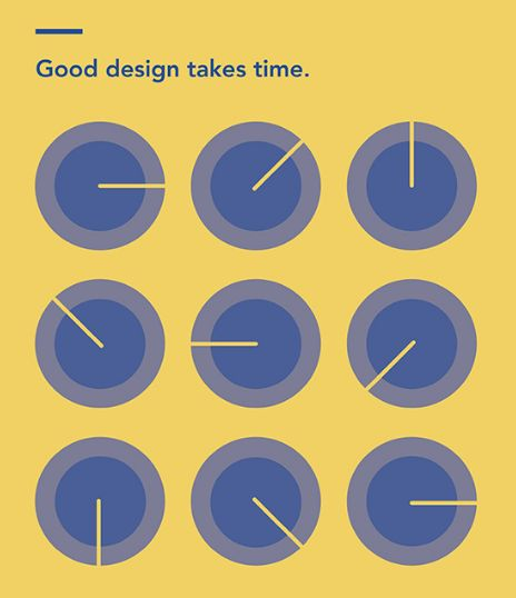
1. Good Design Takes Time
If there’s one thing you take away from the notes above, it’s that good design decisions aren’t just made by chance; they’re made after hours of intensive research and careful planning by your design team.
There’s a lot more to the design process than just making a logo and trying different variations until you have one you like.
For designers, there’s a lot of planning and research work that is done beforehand, including familiarizing themselves with the brand, customer and prospect interviews, and studying a brand’s SEO strategy and content.
2. With Design, You Get What You Pay For
If you’re looking to give your website or brand a complete makeover, investing in a good designer is always worth the extra cost.
An experienced designer will help eliminate a lot of the guesswork involved with design, and will dig right into your brand and personas to develop the best options.
Whether you invest in training or hiring a designer internally, or hire a freelance designer or agency, there are plenty of opportunities and services to hire a properly trained designer today that will actually help you achieve the results you’re looking for.
Or, you can use an automated tool that will help help you avoid the headaches of paying designers to do the job for you… (More on this tomorrow)
3. It’s Not Always About Looks
Yes, a lot of design choices are based on their aesthetics. However, as Steve Jobs said, “design is not just what it looks like and feels like. Design is how it works.”
When designing a website, for example, the first thing, and most important, thing you design for is user experience. Looks are secondary. There are plenty examples of websites that look incredible, but are confusing to navigate.
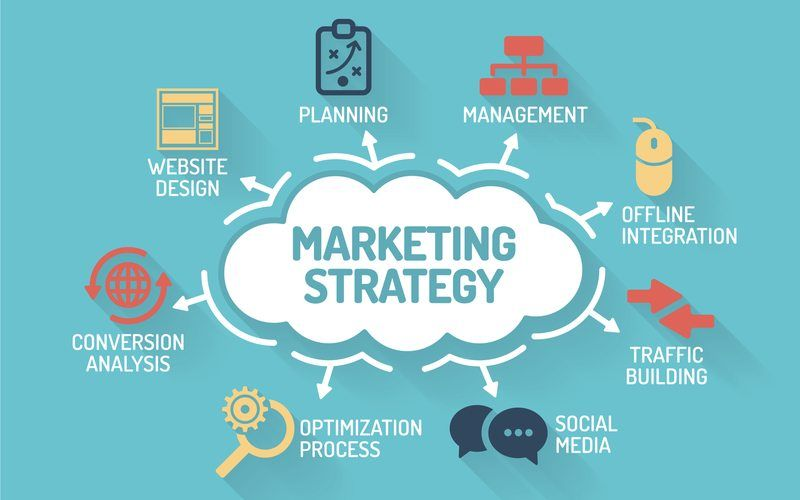
A good designer makes the design work around the content of the website, and helps that content stand out, which helps your personas move smoothly through your site on their search for information.
4. Focus on Your Target Audience
Speaking of personas, your target audience should be your primary design inspiration.
When they visit your site, you want to be thinking how it looks and feels in terms of style, and how they might navigate and interact with your site from different landing points (blog, homepage, landing pages, etc.).
You want to use imagery, color, and fonts that are appealing to them and support your brand’s message.
